
5 Insta-Worthy Garden Colour Schemes
5 Insta-Worthy Garden Colour Schemes
If your phone is almost full to capacity with pictures of gardens, flowers, trees and plants then do not fear - you are among good company with us! We love to take photos of beautiful things and nature seems to be our biggest inspiration. Over 68million posts tagged “#garden” and a staggering 101 million posts tagged “#flower” on Instagram proves how much we love to photograph and share our green fingered efforts.
There is a whole science dedicated to how colour can make us feel (known as colour theory if you would like to learn more). Colour theory involves looking into how we perceive different colours and how they react with each other in people’s perceptions. Colour can evoke a range of emotions and memories – warm colours of autumn, rich hues at Christmas and fresh shades of new life in spring all serve to remind us of seasons passed and give us something to look forward to in the future.
Gardens are said to reflect the gardener’s personality - the easiest way to show this is through the colour in the plants and flowers. Knowing a few professional tips on how to use colour will give the garden a more curated feel if that is what you are seeking.
With this in mind we have 5 camera-worthy garden colour schemes to ensure that your garden will be “liked” a lot!
5. A Timeless Classic
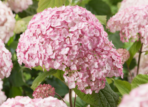
Using just one colour need not be boring, in fact it can create a wonderful scene in the garden. Take white for instance – white flowers work very well as a monochromatic colour scheme, as they contrast well with the green foliage making for a clean, fresh and elegant look in the garden. Focussing on just one colour frees up the opportunity to play around with size, form and texture. For example, big blousy Hydrangea Aborescens ‘Annabelle’, with tall and wispy Thalictrum ‘Splendide White’ and a dainty Erigeron Karvinskianus for ground cover will give a stunning ethereal quality in your photos. The light will play with these tones and textures to create magical images.
4. Cool, Calm and Collected
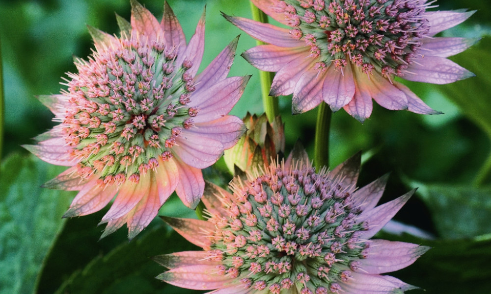
Instagram’s most popular colour is blue and it stands to reason, we all love blue skies and azure seas! Blue in our gardens can make us feel relaxed and calm, even inspired. Focusing on blue in the planting can generate your very own garden sanctuary. To make the blue stand out and to create a complexity in the borders include pinks for contrast and purple to harmonise and give balance. This trinity of colour forms a great team - giving this colour scheme warmth and substance whilst retaining the relaxing feeling. There are only a few true-blue flowers, and they are definitely worth the effort to include for this type of planting scheme. Try Agapanthus ‘Summer Love Blue New’ alongside the subtly pink Astrantia major ‘Florence’ and violet Campanula lactiflora ‘Prichard’s Variety’ in your own garden.
3. Rich and Opulent
Just like interior taste – some people prefer a minimalist Scandi style, where others go for the very opposite – a maximalist, deep sumptuous look. A rich and opulent colour scheme is just the latter. Jewel toned colours pop against foliage to give an intensely rich feel in the garden. Using bright coloured flowers like dahlias, tithonia, cannas and lupins will provide a powerful show stopper of a border. Use plants and foliage to balance out the blooms in terms of colour and texture. Fatsia Japonica with large, shiny emerald leaves will hold its own in this scheme and will work as the main component. Plants such as Carex oshimensis ‘Evergold’ will supply a sumptuous, golden tone to the garden. ‘More is more’ in this scheme although you need to be mindful of balance - creating light and shade so that the planting does not look disorganised.
Plant in clumps and repeat the colours in a pattern through the bed, breaking up big sections of colour with interspersed, luxuriant foliage. Using a variety of different flower shapes helps to not overwhelm the eye so be sure to include a round shape – for example dahlia or rose -with spire shaped flowers like lupins or delphiniums, and flat headed flowers such as achillea.
2. Vintage
The vintage trend has been around for a while now and has an enduring popularity. It continues to be a key trend for gardens and will do so for the foreseeable future. This is, in part, because the colour scheme picks up very well on camera. Antique tones of sepia, mocha and dusky apricot give a romantic, delicate feel which contrasts with the green foliage makes an uplifting colour scheme. This look works well in most gardens and alongside many hard landscaping materials (stonework and fencing). The vintage theme can be achieved throughout the season, although especially in a spring and summer. Consider our ‘Gardeners Dream’ Tulip collection for a little homage to vintage in your own garden this spring.
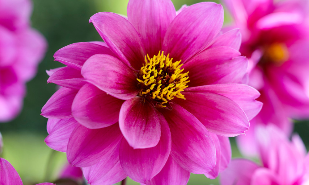
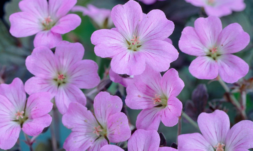
If a vintage inspired summer border is what you covet then Dahlia ‘Café au Lait’ is the ultimate vintage summer bloom, combine with Geranium ‘Dusky Crug’ and Hydrangea paniculata ‘Romantic Ace’ for a refined and stylish vintage look.
1. Opposites Attract
Contrasting colours – also known as complementary colours - will always work well in the garden. It is particularly effective with two colours because they work both with and against each other to provide light and shade. Yellow and purple are a perfect example; the warm tones of yellow are complimented by the more subtle, cooler purple giving the colour scheme depth and interest. There are many ways to effortlessly combine these in the garden. Rudbeckia fulgida var sullivantii ‘Goldsturm’ with their sunny flowers are perfectly paired with the pale purple Aster x frikartii ‘Monch’. Equally beneficial are Verbena Bonariensis with Achillea ‘Summer Gold’ - creating differences in height and texture to give a beautiful prairie style effect.
Regardless of which style or colour scheme there are a couple of tips to keep in mind to really pull things together. First and foremost, remember that green is seen as a neutral colour in gardens so there is no need to include green when choosing your palette. Green can, however, be used in foliage to invigorate a colour scheme and makes an excellent ‘supporting act’.
Another key point is the number of colours to include - generally it is a good idea to go with an odd number – as with planting; think in threes or fives. Many more than this in a smaller area and you risk colours becoming too overpowering. You can, however, utilise all the tones within the colours. Pink shades can range from pale baby pink, which is almost white, to deep magenta, which is almost purple or red toned. This gives greater flexibility within the colours and helps you to achieve the look you are aiming for.
Ultimately – your garden reflects you so if you want to throw the colour ‘rules’ out of the window then - just go for it!
You may surprise yourself with your experimental combinations and, you can experiment safe in the knowledge that f it is not quite right then you can lift it and move it elsewhere. That’s all part of the fun!